For anyone who has used Windows, it's just a matter of seeing the properties of a drive, and you're shown what percentage of the disk is used and which isn't. In Linux though, the sunburst is a seemingly weird representation of disk usage. It's basically a multi-level pie chart.

Thankfully, Ubuntu has the Windows style representation too...
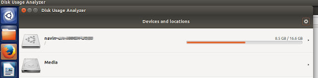
and right-clicking nautilus to see properties also shows you disk usage.

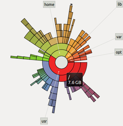
Interpreting the sunburst
This representation isn't much good at showing you how much free space is remaining on your disk. What it's good at showing is which folders are taking up a lot of your space.
The grey circle in the middle represents the root folder of Linux. What you know as "/". The place you reach when you do "cd /". On hovering the mouse pointer over it, it shows me the root folder has 7.6GB of files in it.

The amount of space taken up by the files in root is considered 100%. This does not mean that the disk is 100% full. It means that we are just representing 7.6GB = 100%, so that if any folder in root takes up 4.6GB of space, we can say that the folder is = 4.6/7.6 = 60% of the 100%.
Reds = Folders taking up most space
Purples = Takes up lesser space than reds
Greens = Takes up lesser space than purples
Yellows = Takes up lesser space than greens
Somebody didn't seem to have understood how colour gradients work.

Thankfully, Ubuntu has the Windows style representation too...

and right-clicking nautilus to see properties also shows you disk usage.

Interpreting the sunburst
This representation isn't much good at showing you how much free space is remaining on your disk. What it's good at showing is which folders are taking up a lot of your space.
The grey circle in the middle represents the root folder of Linux. What you know as "/". The place you reach when you do "cd /". On hovering the mouse pointer over it, it shows me the root folder has 7.6GB of files in it.
The amount of space taken up by the files in root is considered 100%. This does not mean that the disk is 100% full. It means that we are just representing 7.6GB = 100%, so that if any folder in root takes up 4.6GB of space, we can say that the folder is = 4.6/7.6 = 60% of the 100%.
Reds = Folders taking up most space
Purples = Takes up lesser space than reds
Greens = Takes up lesser space than purples
Yellows = Takes up lesser space than greens
Somebody didn't seem to have understood how colour gradients work.
You are also shown labels of the next level of folders so that you can narrow down on which of the folders in root is taking up the most space. Hover the mouse pointer over those red spaces (I'll be hovering over the "usr" folder) and you'll see how much of space the folder is taking up.

Let's go deeper than the root folder
Now click on the red "usr" folder, and suddenly, "usr" will be shown as the root folder of the sunburst, and all other coloured semi-circles around "usr", are the child folders of "usr" and the grandchild and great-grandchild and so on....All belonging to "usr" only. No information of the "home" folder or "lib" folder etc. are shown. This is purely for "usr" and the folders contained within it.
But why are only the first few circles forming a full circle? The outer ones are just tiny circle segments. What do they mean?

Notice that the purple folder "share" appears to have 7 folders in it (app-install, pyzy, netbeans etc.) which occupy almost all of the purple space, and there's a bit of empty white space too near the app-install folder. The empty space, is not actually empty. It's full of 342 tiny little files which the disk usage analyzer isn't showing because they are too tiny, and labelling them would clutter up the screen.
Go into "share" which is the subfolder of "usr"
Click on "share", and you'll see some of those files. Also, you'll notice that "doc" is taking up the most space in "share".

See the diagram below to understand the positioning.

Red sector 2 (I'm calling it '2' from now on) is a subfolder of red sector 1 (called as '1' from now on). See how 2 is positioned on top of 1's circumference. 2 only has relevance with respect to 1. Sector 2 is not at all related to the green sector. So the amount of 1's circumference that 2 takes up, shows that 2 takes up approximately 35% space of all the subfolders of 1. The other subfolders of 1 aren't shown because there are plenty of them, but all of them are very tiny compared to 2.
So this is how the disk space usage analyzer (named "Baobab") is interpreted. Hope it's clear to you now. Finally! :-) Phew!
Let's go deeper than the root folder
Now click on the red "usr" folder, and suddenly, "usr" will be shown as the root folder of the sunburst, and all other coloured semi-circles around "usr", are the child folders of "usr" and the grandchild and great-grandchild and so on....All belonging to "usr" only. No information of the "home" folder or "lib" folder etc. are shown. This is purely for "usr" and the folders contained within it.
But why are only the first few circles forming a full circle? The outer ones are just tiny circle segments. What do they mean?
Notice that the purple folder "share" appears to have 7 folders in it (app-install, pyzy, netbeans etc.) which occupy almost all of the purple space, and there's a bit of empty white space too near the app-install folder. The empty space, is not actually empty. It's full of 342 tiny little files which the disk usage analyzer isn't showing because they are too tiny, and labelling them would clutter up the screen.
Go into "share" which is the subfolder of "usr"
Click on "share", and you'll see some of those files. Also, you'll notice that "doc" is taking up the most space in "share".

See the diagram below to understand the positioning.
Red sector 2 (I'm calling it '2' from now on) is a subfolder of red sector 1 (called as '1' from now on). See how 2 is positioned on top of 1's circumference. 2 only has relevance with respect to 1. Sector 2 is not at all related to the green sector. So the amount of 1's circumference that 2 takes up, shows that 2 takes up approximately 35% space of all the subfolders of 1. The other subfolders of 1 aren't shown because there are plenty of them, but all of them are very tiny compared to 2.
So this is how the disk space usage analyzer (named "Baobab") is interpreted. Hope it's clear to you now. Finally! :-) Phew!

No comments:
Post a Comment